Snap Changelogs: AI-Powered Visual Snapshots of Code Evolution
3 Minutes on Why and How Snap Changelogs Work ⏲️
Quick Demo: GitHub Sponsors Add-On Widget 📈
Live Example Snap Changelog
Your followers are ready to be excited about what you're working on...
Are you ready to let them appreciate your latest work? Go beyond static GitHub READMEs. GitClear's dynamic changelog generator allows your followers (and potential followers) a visual glimpse into your recent work. You can embed a GitClear changelog anywhere that you can place an img tag:
- Your GitHub profile,
- Your repo README file,
- Your company's internal wiki or stat dashboard
- ... Or anywhere else where people want to see what you're getting done (e.g., email, TPS reports).
Free1 and updated hourly.
💡 How to publish a dynamic GitHub Profile README: In 3 steps
Here are the steps to publish an automatically-updating GitHub Profile widget to showcase details about the code you're working on.
- Connect your GitHub account and choose up to three repos to showcase (in the free tier, more available in paid tiers)
- Your repos will import within a few hours (up to a day), depending on size and whether you choose a free or paid subscription. After your import is complete, you can browse your stat pages then follow these instructions to create a dynamically updating image of your favorite report(s).
-
After you have the image HTML provided by GitClear through the Snap Changelog instructions,
you have the choice of whether to use it for your personal GitHub profile, or for your repo's README file.
- To use your chart image in your GitHub profile, follow these instructions provided by GitHub.
- To use your chart image in your repo, update the README.md in the root directory of the repo so that it mentions the repo using the standard markdown syntax for an image: 

That's it! Your GitClear chart will refresh every couple hours. GitHub will cache a new version at highly variable intervals, which can be as short as a few hours, or as long as a few days. If you want to force GitHub to refresh the image, you can append a query string to the end of the image URL, like so: 
Sign up via GitHub to get a dynamic profile README
GitClear has offered free, dynamic graphics for GitHub profiles since 2020. We haven't advertised them, since it costs us server processing time to process the code from repos, and we don't monetize these customers in any way yet.
Don't let our lack of advertising scare you off if it would help you to let people see what you're getting done on GitHub.
Snap Changelog live examples
Enough with the static page images, let's look at some live examples of Snap Changelogs! If you open your Inspector tools and inspect the next two images, you can see that they are calling a static UUID with a .png extension.
The png files published are just screenshots of a graph that's periodically rendered in a background process on your behalf.
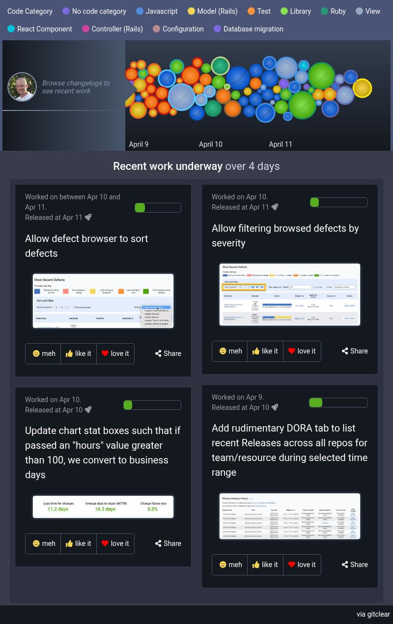
Commit Activity Bubbles
Shows recent work, with commits sized to approximated how much energy that went into completing each commit. The set of commits can be color-coded by either
- Issue/Jira ticket being worked
- Repo
- Branch
- Code Category (shown in example)
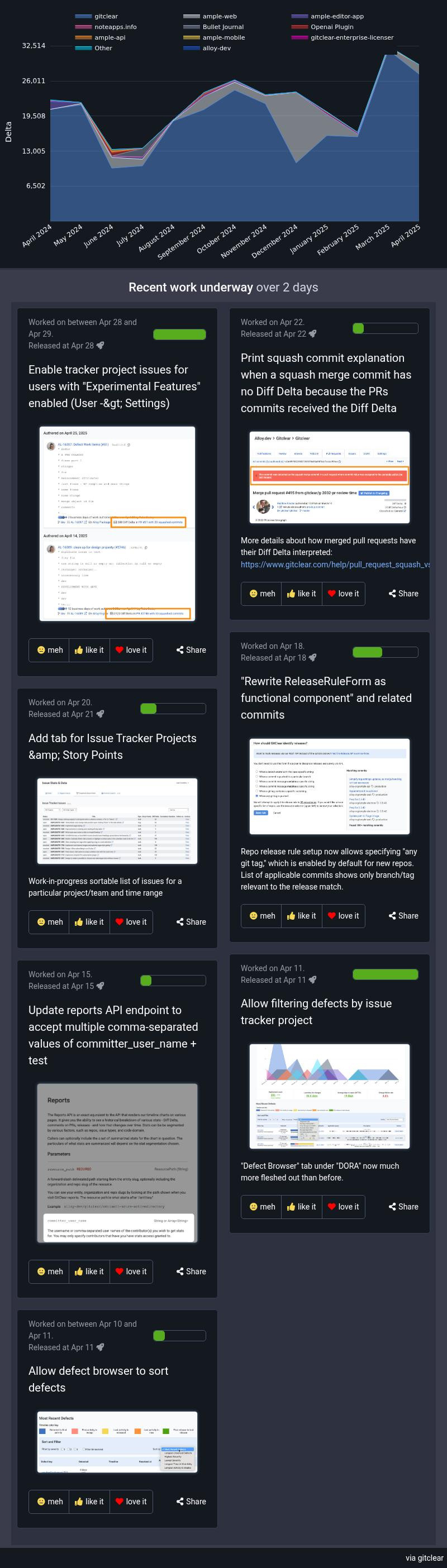
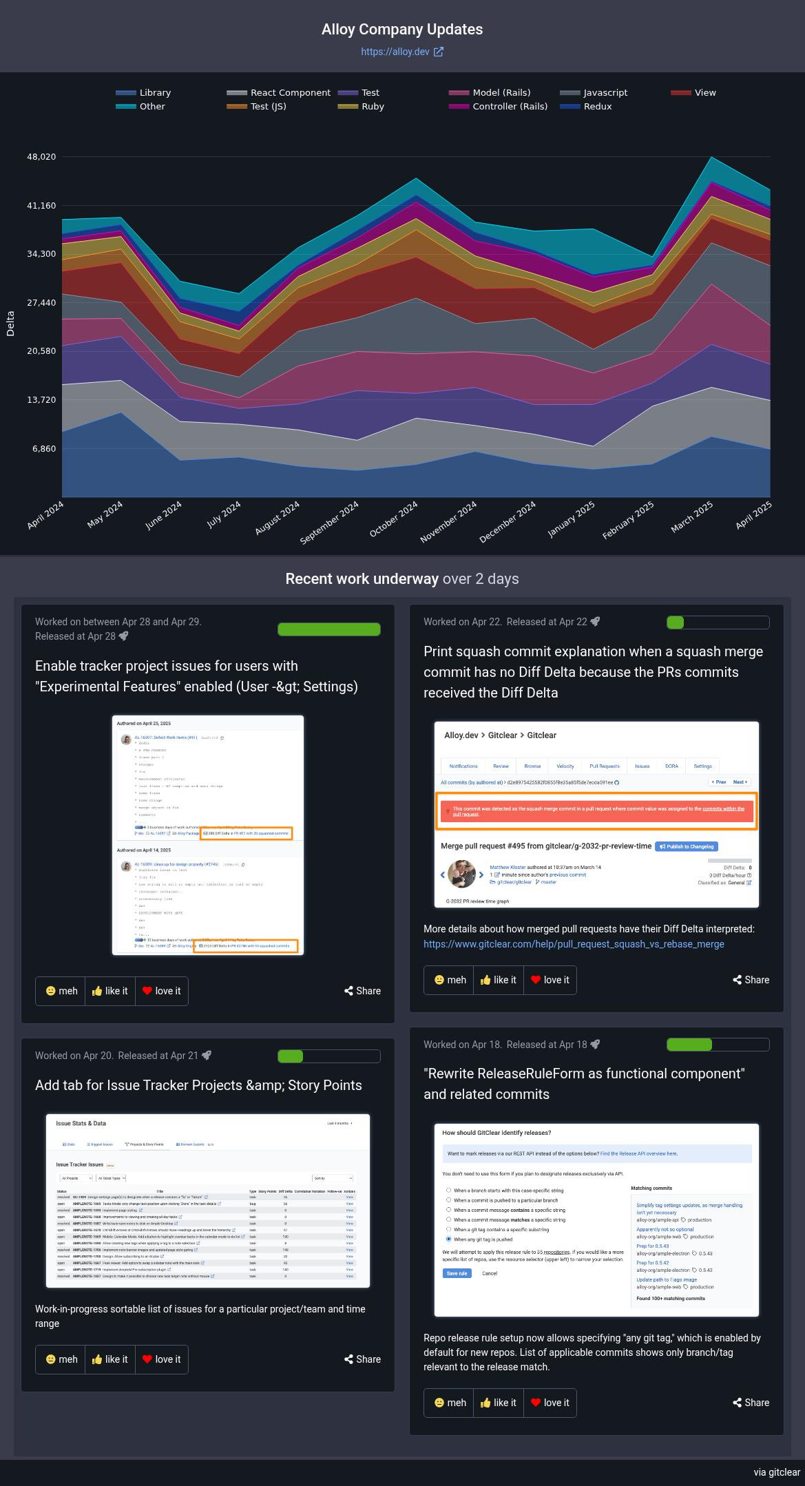
Area Graph
An area graph of some range (as little as a week, as much as 15 years) of the work of you and your team. This Snap Changelog is configured to show all work that our company has done since it was founded in 2008 👴.
Area graph segments can graph Diff Delta (a proxy for "energy required"), colored by any number of available segments:
- Repo
- Issue/Jira ticket being worked
- Type of work (bug fix, feature work, chore, tech debt, etc)
- Code operation (add, delete, moved, replaced, copy/paste)
Recent work underway is an optional section to list Jira tickets that you/team have been working on. You configure the date range, tickets published, and repos eligible.
Take your GitHub profile or repo README to the next level
Move beyond first-generation widgets and summaries. GitClear's Snap Changelogs bring meaningful metric sand detailed breakdowns to your profile.

Profile Widget & GitClear FAQ
Want to learn more about these widgets? Click a question to learn more.
What data does GitClear collect about me to make this widget "free"?
We don't sell your data, we advertise to you as little as possible, and we never share your data with third parties. In order to render your widget, GitClear's database needs to hold the following data:
- Your GitHub username
- The stuff in a GitHub API 'Show Commit' request.
- Your GitHub email address
- Your GitHub avatar image
Per our Security Policy all code line content that we store is encrypted, and purged from our database within a configurable time frame (default: 14 days).
GitClear is a product of Alloy.dev, a software development shop in business more than 15 years. We are not a venture-backed startup, so our incentive is simple: get you to give us a chance. If you do, we think you will notice that GitClear makes code review and repo browsing noticeably faster.
What is the full list of chart types I can generate?
We are adding new charts every quarter, if not every month. Here are the config options available as of Q3 2023:

What providers can I import git data from?
GitClear supports importing from GitHub, GitLab, BitBucket, and Azure DevOps.
Are there territorial restrictions on the free plan?
Yes. In order to keep the free plan free on our bootstrapped company budget, we must be judicious in how many free accounts we carry at a time. We are currently limiting the free plan to users in the United States, Canada, and the United Kingdom. If you are outside of these countries, you can still use GitClear, but you will need to choose a paid plan after your two trial concludes.
What is the difference between the free and paid plans?
The free plan is limited to 3 repos, and 6 months. Paid plans start at $9/month (compare to similar companies). and allow you to import unlimited repos and go back several years.
How do I cancel my account?
You can cancel your Settings page and choosing "Close my account," as illustrated in this help page we created to make it as painless as possible.
If we are going to earn your trust, making it easy to cancel is essential. If you do cancel, all of your data will be purged from our database within a day.
Can I use this with a team?
Yes -- in fact, this is exactly how our team uses our own Snap Changelogs at our company homepage. By publishing all active tickets to our Snap Changelogs, we keep our most enthusiastic customers in the loop on a day-to-day basis.
What is GitClear's primary business?
We started in 2019 focused on creating developer analytics good enough for us to assess whether we (the CEO and Co-Founders of our company are avid individual contributor developers) were making consistent progress toward our development goals.
As the product has matured, we have found the most value in making it very fast to review teammates' code, and to provide real-time stats on where the tech debt in a repo seems to be located. We are especially passionate about cutting out 30-50% of the time required to review PRs in 2023. We think that by the end of this year, our existing diff tool and OpenAI should offer a much better experience than the current state of the art.